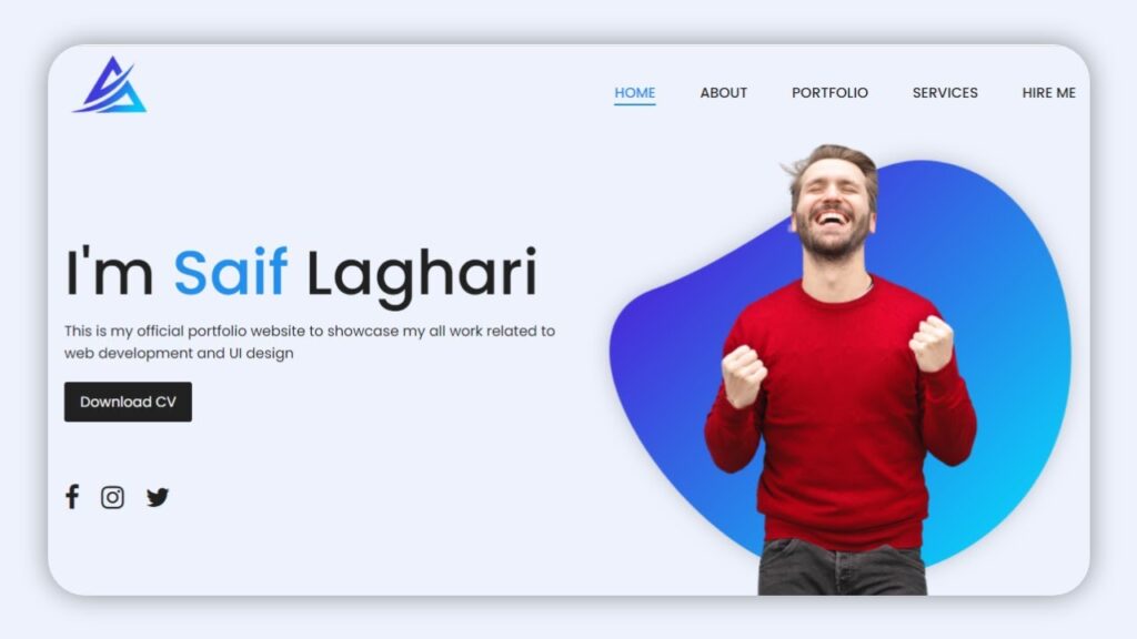
Hello friends! Today we will be learning how to create a responsive website design using HTML, CSS, and JavaScript. This is a new topic that we will be exploring, although I have previously shared videos & articles on working with JavaScript projects.
Responsive design is an important aspect of modern web development, as it allows a website to adapt to the size and capabilities of the device it is being viewed on. By using HTML, CSS, and JavaScript, we can create websites that are user-friendly and easy to navigate on any device.
In this tutorial, we will go through the process of building a responsive website from scratch. You will learn how to structure and style your website using HTML and CSS, and how to add interactivity and functionality using JavaScript. By the end of this tutorial, you will have a solid understanding of how to create responsive websites using these three technologies.
Responsive web design is the practice of building a website that adjusts its layout and content to fit the size of the user’s device screen. This is important because it allows the website to provide an optimal viewing experience for the user, regardless of whether they are accessing the site from a phone, tablet, or desktop computer.
To create a responsive website design using HTML, CSS, and JavaScript, you will need to follow a few key steps:
- Use a responsive grid system: A responsive grid system is a framework that allows you to structure your HTML elements in a way that adjusts to the size of the user’s device screen. This can be achieved using either a flexible grid or a fixed grid.
- Use responsive images: Instead of using fixed-width images, you should use responsive images that automatically adjust their size to fit the width of the container they are in. This can be done using the “max-width” and “height” properties in CSS.
- Use media queries: Media queries allow you to apply different styles to your website based on the size of the user’s device screen. This allows you to create a tailored experience for each device type.
- Test your website: It’s important to test your website on multiple devices to ensure that it looks and functions as intended. You can use tools like browser stack or cross browser testing to do this.
Video Tutorial Of How To Make Responsive Website Design Using HTML CSS & JavaScript
If you have watched the tutorial video on creating a responsive website design using HTML, CSS, and JavaScript and want to try out the code for yourself, you can find it below.
To create this design, you will need to create two files: an HTML file and a CSS file. Start by creating an HTML file and paste the provided code into it. Then, create a CSS file and paste the provided code into it as well. With these steps, you will have the foundation for creating a responsive website design using HTML, CSS, and JavaScript.
It is important to note that responsive design allows a website to adapt to the size and capabilities of the device it is being viewed on. This ensures that the website provides an optimal viewing experience for the user, regardless of the device they are using. By using HTML, CSS, and JavaScript, you can create a website that is visually appealing and easy to navigate on any device.
To begin, create an HTML document called “index.html” and paste the provided code into it. Remember to save the file with the .html extension.
<!DOCTYPE html>
<html lang="en">
<head>
   <meta charset="UTF-8">
   <meta http-equiv="X-UA-Compatible" content="IE=edge">
   <meta name="viewport" content="width=device-width, initial-scale=1.0">
   <link rel="stylesheet" href="style.css">
   <link rel="stylesheet" href="https://cdnjs.cloudflare.com/ajax/libs/font-awesome/4.7.0/css/font-awesome.css" integrity="sha512-5A8nwdMOWrSz20fDsjczgUidUBR8liPYU+WymTZP1lmY9G6Oc7HlZv156XqnsgNUzTyMefFTcsFH/tnJE/+xBg==" crossorigin="anonymous" />
   <title>Responsive Website Design Using Htlm and CSS</title>

   <!-- Created by S-Tech04 -->

</head>
<body>
   <section>
      <header>
         <a href="#" class="logo"><img src="./images/logo1.png"></a>
         <div class="toggle"></div>
         <ul class="navigation">
            <li><a href="#">Home</a></li>
            <li><a href="#">About</a></li>
            <li><a href="#">Portfolio</a></li>
            <li><a href="#">Services</a></li>
            <li><a href="#">Hire me</a></li>
         </ul>
      </header>
      <div class="content">
         <div class="text-content">
            <h1>I'm <span>Saif </span>Laghari</h1>
            <p>This is my official portfolio website to showcase my all work related to <br> web development and UI design</p>
            <a href="#" class="btn">Download CV</a>
            <div class="sci">
               <a href="#"><i class="fa fa-facebook" aria-hidden="true"></i></a>
               <a href="#"><i class="fa fa-instagram" aria-hidden="true"></i></a>
               <a href="#"><i class="fa fa-twitter" aria-hidden="true"></i></a>
            </div>
         </div>
         <div class="imgBx">
            <img src="./images/pattern.png" class="back-img" alt="">
            <img src="./images/img.png" class="front-img" alt="">
         </div>
      </div>
   </section>

   <script>
      const toggleMenu = document.querySelector('.toggle');
      const navigation = document.querySelector('.navigation');
      toggleMenu.addEventListener('click', ()=>{
         toggleMenu.classList.toggle('active');
         navigation.classList.toggle('active');
      })
   </script>
</body>
</html>
Second, make a CSS record with the name of style.css and glue the given codes in your CSS document. Keep in mind, you’ve to make a record with .css extension.
@import url('https://fonts.googleapis.com/css2?family=Poppins:wght@100;200;300;400;500;700;900&display=swap');
*
{
   margin: 0;
   padding: 0;
   box-sizing: border-box;
   font-family: 'Poppins', sans-serif;
}
body
{
   overflow-x: hidden;
}
section
{
   padding: 10px 100px;
   padding-bottom: 0px !important;
   min-height: 100vh;
   position: relative;
   width: 100%;
   background: #edf2fc;
}
section header
{
   position: relative;
   display: flex;
   justify-content: space-between;
   align-items: center;
}
.logo
{
   display: inline-block;
   font-size: 30px;
}
section header .logo img
{
   width: 100px;
}
header .navigation
{
   display: flex;
   justify-content: center;
   align-items: center;
}
.navigation li
{
   list-style: none;
   margin: 25px;
}
.navigation li a
{
   position: relative;
   display: inline-block;
   color: #212121;
   text-decoration: none;
   text-transform: uppercase;
   transition: color 0.5s;
   font-weight: 500;
}
.navigation li a:hover,
.navigation li a.active
{
   color: #228fec;
}
.navigation li a::after
{
   content: '';
   position: absolute;
   top: 100%;
   left: 0;
   background: #228fec;
   height: 2px;
   width: 100%;
   transform: scaleX(0);
   transition: 0.5s;
}
.navigation li a:hover::after,
.navigation li a.active::after
{
   transform: scaleX(1);
}
section .content
{
   display: flex;
   justify-content: space-between;
   align-items: center;
   height: 100%;
   padding-top: 10px;
}
section .content .text-content
{
   width: 50%;
}
.text-content h1
{
   font-size: 70px;
   font-weight: 500;
   color: #212121;
}
.text-content h1 span
{
   color: #228fec;
}
.text-content p
{
   font-size: 1em;
   color: #212121;
}
.text-content .btn
{
   margin-top: 20px;
   padding: 10px 18px;
   background: #212121;
   color: #fff;
   display: inline-block;
   text-decoration: none;
   border-radius: 3px;
   transition: background 0.5s;
}
.text-content .btn:hover
{
   background: #228fec;
}
.sci
{
   margin-top: 70px;
}
.sci .fa
{
   display: inline-block;
   margin-right: 20px;
   font-size: 30px;
   color: #212121;
   transition: color 0.5s, transform 0.5s;
}
.sci .fa:hover
{
   color: #228fec;
   transform: rotate(360deg) scale(1.2);
}
.imgBx
{
   width: 50%;
   height: 520px;
   position: relative;
   bottom: 0;
}
.imgBx img
{
   position: absolute;
   left: 50%;
   bottom: 0;
   transform: translateX(-50%);
   height: 100%;
   transition: bottom 1s,left 1s;
}
.imgBx:hover .back-img
{
   bottom: 40px;
}
.imgBx:hover .front-img
{
   left: 54%;
}

/* now i'll make it responsive */
@media(max-width: 1085px){
   section
   {
      padding: 10px 20px;
      padding-bottom: 0px !important;
   }
   .text-content h1
   {
      font-size: 60px;
   }
}
@media(max-width: 992px)
{
   .toggle
   {
      position: absolute;
      top: 50%;
      right: 0;
      transform: translateY(-50%);
      width: 40px;
      height: 40px;
      background: #228fec url(./images/menu.png);
      background-position: center;
      background-size: 30px;
      background-repeat: no-repeat;
      cursor: pointer;
      z-index: 10000;
      border-radius: 2px;
   }
   .toggle.active
   {
      position: fixed;
      top: 50px;
      right: 20px;
      background: #228fec url(./images/close.png);
      background-position: center;
      background-size: 30px;
      background-repeat: no-repeat;
   }
   .navigation
   {
      display: none !important;
   }
   .navigation.active
   {
      position: fixed;
      top: 0;
      left: 0;
      width: 100%;
      height: 100vh;
      background: #edf2fc;
      display: flex !important;
      justify-content: center;
      align-items: center;
      flex-direction: column;
      z-index: 1000;
   }
   .navigation.active li
   {
      margin: 20px;
   }
   .content
   {
      display: flex;
      flex-direction: column;
   }
   .text-content
   {
      width: 100% !important;
      margin-top: 50px;
   }
}
@media(max-width: 442px)
{
   .text-content h1
   {
      font-size: 2.5em;
   }
   .imgBx
   {
      height: 350px;
   }
}
That’s all, now you’ve successfully created a program to How To Make Responsive Website Design Using Html CSS & JavaScript. If your code doesn’t work or you’ve faced any error/problem, please download the source code files from the given download button. It’s free and a .zip file will be downloaded then you’ve to extract it.
Click on the following download button to download all source code files.


