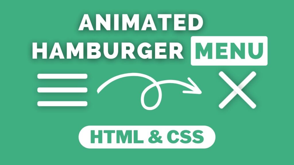
Hello! In this tutorial, we will be learning how to create an animated menu icon using HTML. I have previously shared videos and articles on building projects with JavaScript, but this time we will be doing something different.
Animated menu icons can add an interactive and visually appealing element to your website’s navigation menu. Here’s how you can create one using HTML:
- Choose an image or icon that you want to use for your animated menu. You can create your own icon using a graphic design tool or use a free icon from an online resource such as Flaticon or IconFinder.
- Create a new HTML file and add the necessary structure, including the <head> and <body> tags.
- Within the <head> section, add a link to a CSS file or style the menu icon directly in the HTML file using the <style> tag.
- In the <body> section, add the menu icon using the <img> tag and specify the source of the image using the src attribute.
- Use the :hover pseudo-class to define the style of the menu icon when the user hovers over it with their mouse. For example, you could change the color or size of the icon to create an animation effect.
- To create a more complex animation, you can use CSS3 transitions and transformations.
Video Tutorial Of How To Make Animated Menu Icon Using HTML
In the tutorial video for creating an animated menu icon, if you become bored and want to try out the code for yourself, you can find it below. To create this animation, you will need to create two files: an HTML file and a CSS file.
Start by creating an HTML file called “index.html” and paste the provided code into it. Don’t forget to save the file with a .html extension.
<!DOCTYPE html>
<html lang="en">
<head>
    <meta charset="UTF-8">
    <meta name="viewport" content="width=device-width, initial-scale=1.0">
    <link rel="stylesheet" href="style.css">
    <title>Animated menu icon</title>
</head>
<body>
    <div class="menu-icon">
        <div class="line-1 no-animation"></div>
        <div class="line-2 no-animation"></div>
        <div class="line-3 no-animation"></div>
    </div>
    <script>
        const menu = document.querySelector('.menu-icon')
        const line_1 = document.querySelector('.line-1')
        const line_2 = document.querySelector('.line-2')
        const line_3 = document.querySelector('.line-3')
        menu.addEventListener('click', ()=>{
            menu.classList.toggle('active');
            line_1.classList.remove('no-animation');
            line_2.classList.remove('no-animation');
            line_3.classList.remove('no-animation');
        })
    </script>
</body>
</html>
Next, create a CSS file called “style.css” and paste the given code into it. Remember to save the file with the .css extension.
*
{
    margin: 0;
    padding: 0;
    box-sizing: border-box;
}
body
{
    background: #3faf82;
    display: flex;
    justify-content: center;
    align-items: center;
    height: 100vh;
}
.menu-icon {
    width: 80px;
    height: 52px;
    cursor: pointer;
    z-index: 50;
}
.menu-icon .line-1,
.menu-icon .line-2,
.menu-icon .line-3 {
    height: 8px;
    width: 100%;
    background-color: #fff;
    border-radius: 3px;
    box-shadow: 0 2px 10px 0 rgba(0, 0, 0, 0.3);
    transition: background-color 0.2s ease-in-out;
}
.menu-icon .line-1 {
    animation: animate-line-1-rev 0.7s ease-in-out;
}
.menu-icon .line-2 {
    margin: 14px 0;
    animation: animate-line-2-rev 0.7s ease-in-out;
}
.menu-icon .line-3 {
    animation: animate-line-3-rev 0.7s ease-in-out;
}

.menu-icon.active .line-1 {
    animation: animate-line-1 0.7s cubic-bezier(0.3, 1, 0.7, 1) forwards;
}
.menu-icon.active .line-2 {
    animation: animate-line-2 0.7s cubic-bezier(0.3, 1, 0.7, 1) forwards;
}
.menu-icon.active .line-3 {
    animation: animate-line-3 0.7s cubic-bezier(0.3, 1, 0.7, 1) forwards;
}

.no-animation {
    animation: none !important;
}

@keyframes animate-line-1 {
    0% {
      transform: translate3d(0, 0, 0) rotate(0deg);
    }
    50% {
      transform: translate3d(0, 22px, 0) rotate(0);
    }
    100% {
      transform: translate3d(0, 22px, 0) rotate(45deg);
    }
}
@keyframes animate-line-2 {
    0% {
      transform: scale(1);
      opacity: 1;
    }
    100% {
      transform: scale(0);
      opacity: 0;
    }
}
@keyframes animate-line-3 {
    0% {
      transform: translate3d(0, 0, 0) rotate(0deg);
    }
    50% {
      transform: translate3d(0, -22px, 0) rotate(0);
    }
    100% {
      transform: translate3d(0, -22px, 0) rotate(135deg);
    }
}
@keyframes animate-line-1-rev {
    0% {
      transform: translate3d(0, 22px, 0) rotate(45deg);
    }
    50% {
      transform: translate3d(0, 22px, 0) rotate(0);
    }
    100% {
      transform: translate3d(0, 0, 0) rotate(0deg);
    }
}
@keyframes animate-line-2-rev {
    0% {
      transform: scale(0);
      opacity: 0;
    }
    100% {
      transform: scale(1);
      opacity: 1;
    }
}
@keyframes animate-line-3-rev {
    0% {
      transform: translate3d(0, -22px, 0) rotate(135deg);
    }
    50% {
      transform: translate3d(0, -22px, 0) rotate(0);
    }
    100% {
      transform: translate3d(0, 0, 0) rotate(0deg);
    }
}
With that, you have successfully created a program for creating an animated menu icon using HTML and JavaScript. If you run into any issues or errors, you can download the source code files by clicking on the provided download button. The files are available for free and will be downloaded as a .zip file. Extract the file to access the source code files.


