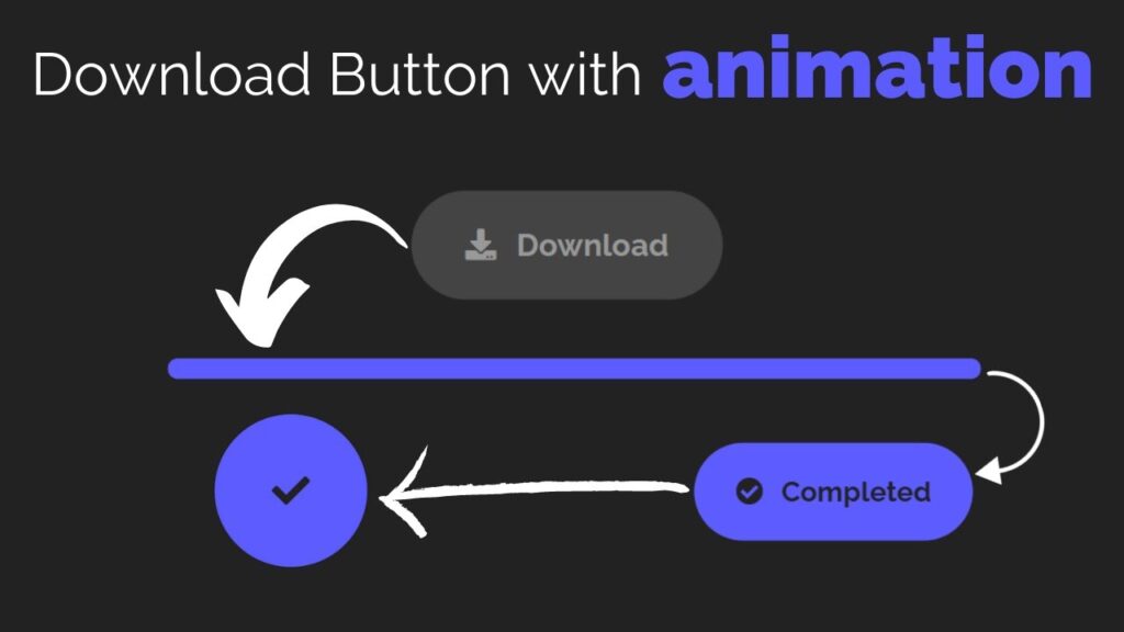
Creating a download button with animation using HTML and CSS is a simple process that can add a professional touch to your website. To create a download button, you will need to use the HTML <a> element, which stands for anchor. This element is used to create hyperlinks, which allow users to navigate to other pages or locations on the web.
To create a download button, you will need to set the href attribute to the URL of the file you want to download, and you can also use the download attribute to specify that the file should be downloaded rather than opened in the browser. To add animation to the download button, you can use CSS.
CSS, or Cascading Style Sheets, is a stylesheet language that is used to describe the look and formatting of a document written in HTML. With CSS, you can control the color, font, size, and layout of your HTML elements, as well as add effects like hover states and transitions.
Video Tutorial of How To Create Download Button With Animation Using HTML and CSS
As you have seen on the given video tutorial of How to create Download Button With Animation Using HTML and CSS, If you are feeling bored watching the given video tutorial of How to create Download Button With Animation Using HTML and CSS then you can copy or download the given codes below:
To create this program (Download Button). First, you need to create two Files one HTML File and another one is CSS File. After creating these files just paste the following codes in your file.
In the first place, make a HTML document with the name of index.html and paste the given codes in your HTML record. Keep in mind, you’ve to make a document with .html extension.
<!DOCTYPE html>
<html lang="en">
<head>
    <meta charset="UTF-8">
    <meta http-equiv="X-UA-Compatible" content="IE=edge">
    <meta name="viewport" content="width=device-width, initial-scale=1.0">
    <link rel="stylesheet" href="https://cdnjs.cloudflare.com/ajax/libs/font-awesome/5.15.4/css/all.min.css" integrity="sha512-1ycn6IcaQQ40/MKBW2W4Rhis/DbILU74C1vSrLJxCq57o941Ym01SwNsOMqvEBFlcgUa6xLiPY/NS5R+E6ztJQ==" crossorigin="anonymous" referrerpolicy="no-referrer" />
    <link rel="stylesheet" href="style.css">
    <title>Download Button</title>
    <!-- S-Tech04 -->
</head>
<body>
    <a href="#" class="btn">
        <div class="completed">
            <i class="fas fa-check-circle"></i>
            <span>Completed</span>
        </div>
        <div class="download">
            <i class="fas fa-download"></i>
            <span>Download</span>
        </div>
    </a>

    <script>
        const btn = document.querySelector('.btn')
        btn.addEventListener('click',()=>{
            btn.classList.add('active')
            setTimeout(() => {
                btn.classList.remove('active')
            }, 13000);
        })
    </script>
</body>
</html>
Second, make a CSS record with the name of style.css and glue the given codes in your CSS document. Keep in mind, you’ve to make a record with .css extension.
@import url('https://fonts.googleapis.com/css2?family=Raleway:wght@100;200;300;400;500;600;700;800;900&display=swap');
*
{
  margin: 0;
  padding: 0;
  box-sizing: border-box;
  font-family: 'Raleway', Arial, sans-serif;
}
body
{
  display: flex;
  justify-content: center;
  align-items: center;
  text-align: center;
  background: #222;
  min-height: 100vh;
}
.btn
{
  position: relative;
  width: 200px;
  height: 70px;
  background: #444;
  color: #999;
  font-size: 20px;
  font-weight: 700;
  border-radius: 50px;
  cursor: pointer;
  text-decoration: none;
  transition: 0.8s;
  transition-delay: 0.5s;
  overflow: hidden;
}
.btn .fas
{
  margin-right: 8px;
}
.btn .download
{
  position: absolute;
  top: 50%;
  left: 50%;
  transform: translate(-50%,-50%);
  white-space: nowrap;
  transition: 0.3s;
}
.btn.active .download
{
  transform: translate(-50%,60px);
  animation: bottom_top 0.5s linear forwards;
  animation-delay: 12s;
}
.btn .completed
{
  position: absolute;
  top: 0%;
  left: 50%;
  transform: translate(-50%,-60px);
  white-space: nowrap;
  color: #222;
}
.btn.active .completed
{
  animation: top_bottom 1.3s linear forwards;
  animation-delay: 6.5s;
}
.btn.active
{
  width: 600px;
  height: 15px;
  animation: btn_width 4.5s linear forwards;
  animation-delay: 5s;
}
.btn.active::before
{
  content: '';
  position: absolute;
  top: 0;
  left: 0;
  width: 0;
  height: 100%;
  background: #5c5cff;
  animation: before_active 10s linear forwards;
  animation-delay: 1.5s;
}
.btn.active::after
{
  content: '\f00c';
  position: absolute;
  top: 50%;
  left: 50%;
  font-family: "Font Awesome 5 Free";
  color: #222;
  transform: translate(-50%,-50%) scale(0);
  transition: 0.3s;
  animation: check_scale 2s linear forwards;
  animation-delay: 8.5s;
}
@keyframes before_active
{
  0%
  {
    width: 0%;
    height: 100%;
  }
  30%,95%
  {
    width: 100%;
    height: 100%;
  }
  100%
  {
    width: 100%;
    height: 0%;
  }
}
@keyframes btn_width
{
  0%
  {
    width: 600px;
    height: 15px;
  }
  20%,70%
  {
    width: 200px;
    height: 70px;
  }
  80%,90%
  {
    width: 100px;
    height: 100px;
  }
  100%
  {
    width: 200px;
    height: 70px;
  }
}
@keyframes top_bottom
{
  0%
  {
    transform: translate(-50%,-60px);
  }
  20%,90%
  {
    top: 50%;
    transform: translate(-50%,-50%);
  }
  100%
  {
    top: 120%;
    transform: translate(-50%,-50%);
  }
}
@keyframes bottom_top
{
  0%
  {
    transform: translate(-50%,60px);
  }
  100%
  {
    transform: translate(-50%,-50%);
  }
}
@keyframes check_scale
{
  0%
  {
    transform: translate(-50%,-50%) scale(0);
  }
  20%,90%
  {
    transform: translate(-50%,-50%) scale(1.3);
  }
  100%
  {
    transform: translate(-50%,100px) scale(1.3);
  }
}
Click on the following download button to download all source code files.