Hello friends, today we will be going to how do we create card hover effect using HTML, CSS and JavaScript. I have posted many videos and articles before related to theJavaScriptproject, now this the something new that we are going to build.
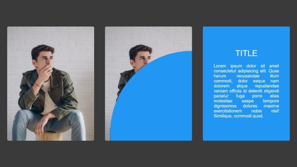
Creating a creative card hover effect can add an interactive and visually appealing element to your website or web application. This effect can be achieved using HTML and CSS, and can be customized to fit the specific design needs of your project.
To create a card hover effect, you will need to start by setting up the HTML structure for your card. This will typically include a container element, such as a div, and a series of inner elements for the card content. For example, you might have a title, an image, and some descriptive text.
Next, you will need to style these elements using CSS. This will involve defining the layout and appearance of the card, as well as any hover effects you want to include. To create a hover effect, you will need to use the :hover pseudo-class in your CSS. This will allow you to define a set of styles that will be applied when the user’s mouse hovers over the card.
For example, you might want to change the background color of the card when it is hovered over, or you might want to add a drop shadow or border to give the card a raised or three-dimensional effect. You can also use the transition property to create a smooth and seamless transition between the normal and hover states of the card. In addition to these basic styles, you can also add additional interactivity to your card hover effect by using JavaScript or other programming languages.
For example, you might want to include a link or button that appears when the card is hovered over, or you might want to display additional information or a pop-up window.
Overall, creating a creative card hover effect using HTML and CSS is a simple and effective way to add interactive and visually appealing elements to your website or web application. By using the :hover pseudo-class and the transition property, you can create a variety of hover effects that will engage and delight your users.
Video Tutorial of How To Create Card Hover Effect Using HTML, CSS & JavaScript
How To Create Card Hover Effect Using HTML, CSS & JavaScript | Free Source Code
To create this program (Hover Effect). First, you need to create two Files one HTML File and another one is CSS File. After creating these files just paste the following codes in your file.
In the first place, make a HTML document with the name of index.html and paste the given codes in your HTML record. Keep in mind, you’ve to make a document with .html extension.
<!DOCTYPE html>
<html lang="en">
<head>
    <meta charset="UTF-8">
    <meta http-equiv="X-UA-Compatible" content="IE=edge">
    <meta name="viewport" content="width=device-width, initial-scale=1.0">
    <link rel="stylesheet" href="style.css">
    <title>Card Hover Effect</title>
    <!-- S-Tech04 -->
</head>
<body>
    <div class="card">
        <div class="card-img">
            <img src="./img1.jpg" alt="">
        </div>
        <div class="card-contant">
            <h2>Title</h2>
            <p>Lorem ipsum dolor sit amet consectetur adipisicing elit. Quas harum recusandae illum commodi, dolor eaque nam dolorem atque repudiandae veniam officiis id deleniti eligendi pariatur fuga porro alias molestiae saepe tempore dignissimos dolores maxime exercitationem nobis nisi! Similique, commodi quod.</p>
        </div>
    </div>
    <div class="card">
        <div class="card-img">
            <img src="./img2.jpg" alt="">
        </div>
        <div class="card-contant">
            <h2>Title</h2>
            <p>Lorem ipsum dolor sit amet consectetur adipisicing elit. Quas harum recusandae illum commodi, dolor eaque nam dolorem atque repudiandae veniam officiis id deleniti eligendi pariatur fuga porro alias molestiae saepe tempore dignissimos dolores maxime exercitationem nobis nisi! Similique, commodi quod.</p>
        </div>
    </div>
    <div class="card">
        <div class="card-img">
            <img src="./img3.jpg" alt="">
        </div>
        <div class="card-contant">
            <h2>Title</h2>
            <p>Lorem ipsum dolor sit amet consectetur adipisicing elit. Quas harum recusandae illum commodi, dolor eaque nam dolorem atque repudiandae veniam officiis id deleniti eligendi pariatur fuga porro alias molestiae saepe tempore dignissimos dolores maxime exercitationem nobis nisi! Similique, commodi quod.</p>
        </div>
    </div>

    <script>
        const cards = document.querySelectorAll('.card')
        cards.forEach(element => {
            element.onmousemove = (e)=>{
                let x = e.pageX - element.offsetLeft;
                let y = e.pageY - element.offsetTop;
                element.style.setProperty('--x', x + "px")
                element.style.setProperty('--y', y + "px")
            }
        });
    </script>
</body>
</html>
Second, make a CSS record with the name of style.css and paste the given codes in your CSS document.
@import url('https://fonts.googleapis.com/css2?family=Raleway:wght@100;200;300;400;500;600;700;800;900&display=swap');
*
{
  margin: 0;
  padding: 0;
  box-sizing: border-box;
  font-family: 'Raleway', Arial, sans-serif;
}
body
{
  width: 100%;
  min-height: 100vh;
  display: flex;
  justify-content: center;
  align-items: center;
  background: #3a3a3a;
}
.card
{
  width: 320px;
  height: 420px;
  position: relative;
  overflow: hidden;
  border-radius: 5px;
  z-index: 1;
  margin: 20px;
}
.card::before
{
  content: '';
  position: absolute;
  top: var(--y);
  left: var(--x);
  transform: translate(-50%,-50%);
  width: 0;
  height: 0;
  background: #2196f3;
  z-index: 2;
  border-radius: 50%;
  transition: width 0.8s,height 0.8s;
}
.card:hover::before
{
  transition: 0.5s;
  width: 1000px;
  height: 1000px;
}
.card .card-img
{
  position: absolute;
  top: 0;
  left: 0;
  width: 100%;
  height: 100%;
  object-fit: cover;
}
.card .card-img img
{
  width: 100%;
  height: 100%;
  object-fit: cover;
}
.card .card-contant
{
  position: absolute;
  top: 0;
  left: 0;
  width: 100%;
  height: 100%;
  padding: 40px;
  text-align: justify;
  color: #fff;
  display: flex;
  justify-content: center;
  align-items: center;
  flex-direction: column;
  transition: 0s;
  opacity: 0;
  pointer-events: none;
  z-index: 3;
}
.card-contant h2
{
  font-size: 30px;
  font-weight: 500;
  margin-bottom: 20px;
  text-transform: uppercase;
}
.card:hover .card-contant
{
  transition: 0.2s;
  transition-delay: 0.5s;
  opacity: 1;
  pointer-events: auto;
}
Click on the following download button to download all source code files.