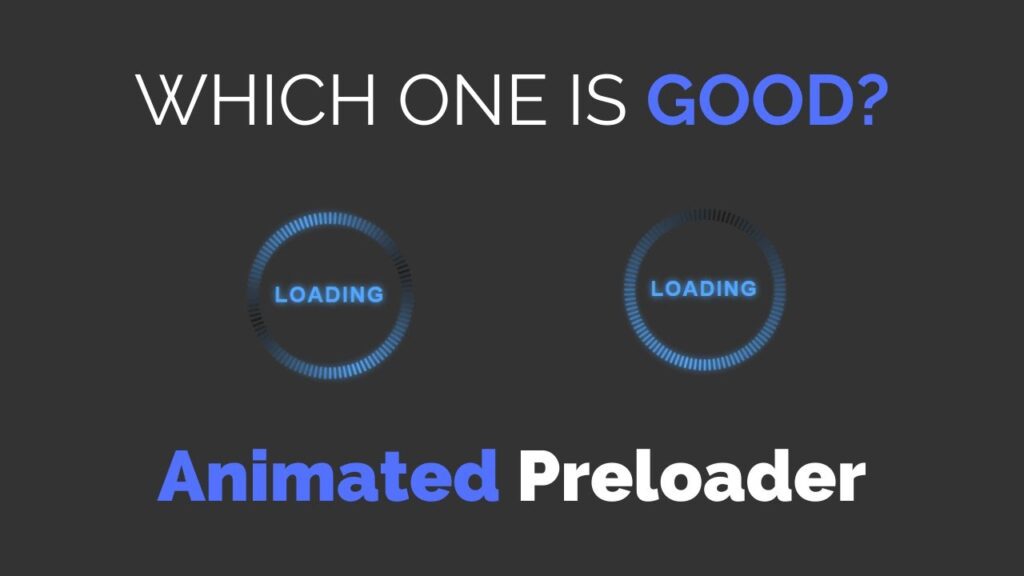
An animated preloader is a visual element that is displayed on a webpage while the content is being loaded. It helps to improve the user experience by indicating that the webpage is actively loading and not stuck. There are various ways to create an animated preloader using HTML, CSS, and JavaScript.
One approach is to use an animated GIF image as the preloader. This can be done by simply adding the GIF file to the HTML page using the img element.
Another approach is to create a custom animated preloader using HTML, CSS, and JavaScript. This involves creating an HTML element, such as a div, to hold the preloader, and then using CSS to style and animate it.
The JavaScript can be used to control the animation and to hide the preloader when the content has finished loading.
Video Tutorial of How To Create Animated Preloader Using HTML, CSS and JavaScript
To create an animated preloader using HTML, CSS and JavaScript, you will need to:
- Create two files – an HTML file and a CSS file
- Paste the provided code in each respective file
- Ensure that the HTML file is saved with the .html extension.
- Make sure that the HTML file is named as “index.html”
Please note that to run the preloader, you also need to add JavaScript code for animation and make sure that the HTML, CSS and JS files are properly linked
<!DOCTYPE html>
<html lang="en">
<head>
    <meta charset="UTF-8">
    <meta http-equiv="X-UA-Compatible" content="IE=edge">
    <meta name="viewport" content="width=device-width, initial-scale=1.0">
    <title>Animated Circular Preloader</title>
    <link rel="stylesheet" href="./style.css">
    <!-- S-Tech04 -->
</head>
<body>
    <div class="box">
        <div class="circle" dots="100"></div>
        <span>LOADING</span>
    </div>

    <script src="./script.js"></script>
</body>
</html>
Second, make a CSS record with the name of style.css and paste the given codes in your CSS document. Keep in mind, you’ve to make a record with .css extension.
*
{
    margin: 0;
    padding: 0;
    box-sizing: border-box;
    font-family: sans-serif;
}
body
{
    display: flex;
    justify-content: center;
    align-items: center;
    background: #333;
    min-height: 100vh;
}
.box
{
    margin: 20px;
    position: relative;
}
.box span
{
    position: absolute;
    top: 50%;
    left: 50%;
    transform: translate(-50%,-50%);
    font-size: 28px;
    font-weight: 700;
    color: #52a8ff;
    letter-spacing: 2px;
    text-shadow: 0 0 10px #52a8ff;
}
.circle
{
    width: 200px;
    height: 200px;
    display: flex;
    justify-content: center;
    align-items: center;
}
.circle .points
{
    width: 3px;
    height: 15px;
    background: #0007;
    position: absolute;
    border-radius: 3px;
    transform: rotate(calc(var(--i)*var(--rot))) translateY(-100px);
    animation: glow 0.5s linear infinite;
    animation-delay: calc(var(--i)*0.01s);

}
@keyframes glow
{
    0%
    {
        background: #0007;
        box-shadow: none;
    }
    50%
    {
        background: #52a8ff;
        box-shadow: 0 0 10px #52a8ff;
    }
    100%
    {
        background: #0007;
        box-shadow: none;
    }
}
last, create a JavaScript file with the name of script.js and paste the given codes in your JavaScript file. Remember, you’ve to create a file with .js extension.
const circles = document.querySelectorAll('.circle');
circles.forEach(elem=>{
    var dots = elem.getAttribute('dots');
    var points = '';
    var rotate = 360/dots;
    for (var i = 0; i < dots; i++) {
        points+= `<div class="points" style="--i: ${i}; --rot: ${rotate}deg;"></div>`
    };
    elem.innerHTML = points;
})
That’s all, now you’ve successfully created a program to Create Animated Preloader using HTML, CSS and JavaScript. If your code doesn’t work or you’ve faced any error/problem, please download the source code files from the given download button. It’s free and a .zip file will be downloaded then you’ve to extract it.
Click on the following download button to download all source code files.


