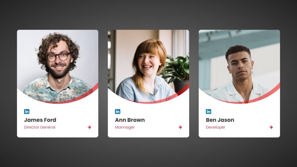
To create a visually appealing and effective “Our Team” section on a website using HTML and CSS, you should first outline the content and structure of the section, including the names, job titles, and short bios of each team member as well as any images or headshots.
Next, use HTML to structure the content and add any images using the <img> element with appropriate alt text.
Then, use CSS to style the section by setting the font and color scheme, adding background colors or images, and using layout techniques like flexbox or grid. Finally, consider adding interactive features such as hover effects or modal windows to display more detailed information about each team member.
Video Tutorial of Creative Our Team Section Using HTML & CSS
In case you’re feeling uninterested in watching the video tutorial for creating a creative our team section using HTML and CSS, you can instead copy or download the following code snippets:
One way to structure an “Our Team” section is to use a grid layout, where each team member is represented by a separate box or card. This can be achieved using the HTML div element and applying the display: flex or display: grid property in the CSS.
Inside each box or card, we can use the h2 element for the team member’s name, the p element for their job title and a short bio, and the img element to include a profile picture. We can also include social media links or contact information using the a element and font icons.
To create this creative our team section using HTML and CSS, you will need to create two files: one HTML file and one CSS file. Once you have created these files, simply paste the provided code into them.
First, create an HTML document called index.html and paste the provided code into it. Remember to save the file with a .html extension.
<!DOCTYPE html>
<html lang="en">
<head>
    <meta charset="UTF-8">
    <meta name="viewport" content="width=device-width, initial-scale=1.0">
    <link rel="stylesheet" href="https://cdnjs.cloudflare.com/ajax/libs/font-awesome/4.7.0/css/font-awesome.css" integrity="sha512-5A8nwdMOWrSz20fDsjczgUidUBR8liPYU+WymTZP1lmY9G6Oc7HlZv156XqnsgNUzTyMefFTcsFH/tnJE/+xBg==" crossorigin="anonymous" referrerpolicy="no-referrer" />
    <link rel="stylesheet" href="./style.css">
    <title>Card Hover Effect</title>
</head>
<body>
    <div class="card">
        <div class="circle">
            <div class="imgBox">
                <img src="./team1.jpg" alt="">
            </div>
        </div>
        <div class="content">
            <a href="#">
                <i class="fa fa-linkedin" aria-hidden="true"></i>
            </a>
            <h3>James Ford</h3>
            <div class="textIcon">
                <h4>Director General</h4>
                <a href="#">
                    <i class="fa fa-arrow-right" aria-hidden="true"></i>
                </a>
            </div>
        </div>
    </div>
    <div class="card">
        <div class="circle">
            <div class="imgBox">
                <img src="./team2.jpg" alt="">
            </div>
        </div>
        <div class="content">
            <a href="#">
                <i class="fa fa-linkedin" aria-hidden="true"></i>
            </a>
            <h3>Ann Brown</h3>
            <div class="textIcon">
                <h4>Mannager</h4>
                <a href="#">
                    <i class="fa fa-arrow-right" aria-hidden="true"></i>
                </a>
            </div>
        </div>
    </div>
    <div class="card">
        <div class="circle">
            <div class="imgBox">
                <img src="./team3.jpg" alt="">
            </div>
        </div>
        <div class="content">
            <a href="#">
                <i class="fa fa-linkedin" aria-hidden="true"></i>
            </a>
            <h3>Ben Jason</h3>
            <div class="textIcon">
                <h4>Developer</h4>
                <a href="#">
                    <i class="fa fa-arrow-right" aria-hidden="true"></i>
                </a>
            </div>
        </div>
    </div>
</body>
</html>
Second, make a CSS record with the name of style.css and glue the given codes in your CSS document. Keep in mind, you’ve to make a record with .css extension.
@import url('https://fonts.googleapis.com/css2?family=Poppins:wght@100;200;300;400;500;700;900&display=swap');
*
{
   margin: 0;
   padding: 0;
   box-sizing: border-box;
   font-family: "Poppins",sans-serif;
}
body
{
   display: flex;
   justify-content: center;
   align-items: center;
   flex-wrap: wrap;
   min-height: 100vh;
   width: 100%;
   background: radial-gradient(#777,#222);
}
.card
{
   position: relative;
   width: 340px;
   height: 450px;
   background: #fff;
   overflow: hidden;
   border-radius: 10px;
   margin: 20px;
}
.card .circle
{
   position: absolute;
   top: -190px;
   left: 50%;
   width: 500px;
   height: 500px;
   transform: translateX(-50%);
   clip-path: circle();
}
.card .circle::before
{
   content: '';
   position: absolute;
   top: -8px;
   left: -16px;
   width: 100%;
   height: 100%;
   box-shadow: 0 0 0 20px rgba(255,0,0,0.5);
   border-radius: 50%;
   z-index: 2;
   pointer-events: none;
}
.circle .imgBox
{
   position: absolute;
   left: 50%;
   bottom: 0;
   transform: translateX(-50%);
   width: 340px;
   height: 310px;
}
.imgBox img
{
   position: absolute;
   top: 0;
   left: 0;
   object-fit: cover;
   width: 100%;
   height: 100%;
   transition: all 0.5s;
}
.imgBox img:hover
{
   transform: scale(1.2);
}
.card .content
{
   position: absolute;
   left: 0;
   bottom: 0;
   width: 100%;
   height: 140px;
   padding: 20px 30px;
}
.content .fa-linkedin
{
   padding: 2px 4px;
   color: #fff;
   background: #0077b5;
   border-radius: 2px;
}
.content h3
{
   font-size: 1.4em;
   color: #333;
   margin-top: 7px;
   margin-bottom: 2px;
}
.content .textIcon
{
   display: flex;
   justify-content: space-between;
   align-items: center;
   width: 100%;
}
.content .textIcon h4
{
   color: #e91e63;
   font-weight: 400;
}
.content .textIcon .fa-arrow-right
{
   color: #e91e63;
}
That’s it! You have now successfully created a program for a creative our team section using HTML, CSS, and JavaScript. If you encounter any issues or errors while working on your code, you can download the source code files by clicking the provided download button. The files are free and will be downloaded as a zip file, which you will need to extract.
Click the following button to download all the source code files.


