A hover effect occurs when a user’s cursor or pointer passes over an element on a webpage, and it can be used to add interactivity and visual interest to a website. In HTML and CSS, it’s possible to create a hover effect for a button by using the “:hover” pseudo-class in your CSS code.
To create a hover effect for a button, you will need to start by designing the normal (non-hover) state of the button. This can be done using basic HTML and CSS techniques, such as setting the background color, text color, font, and padding for the button.
Once you have designed the normal state of the button, you can use the “:hover” pseudo-class to specify the styles that should be applied when a user’s cursor hovers over the button. For example, you might want to change the background color or text color of the button when it is hovered over.
It’s also important to note that the hover effect will only be visible to users who are using a pointing device, such as a mouse. Users who are using a touch screen or keyboard will not see the hover effect.
To create a hover effect for a button, you will need to have a basic understanding of HTML and CSS. If you are new to web development, you may want to consider taking a course or tutorial to learn these skills. Once you have a good foundation in HTML and CSS, you will be able to create a wide range of hover effects for your buttons and other web page elements.
In HTML and CSS, it is possible to create a hover effect on a button by using the “:hover” pseudo-class in the CSS code. This allows the designer to specify the styles that should be applied to the button when a user’s cursor hovers over it. The hover effect can include changes to the button’s background color, text color, font, padding, and other styles. It is important to note that the hover effect will only be visible to users with a pointing device and will not be seen by users on touch screens or using a keyboard. To create a hover effect, a basic understanding of HTML and CSS is necessary.
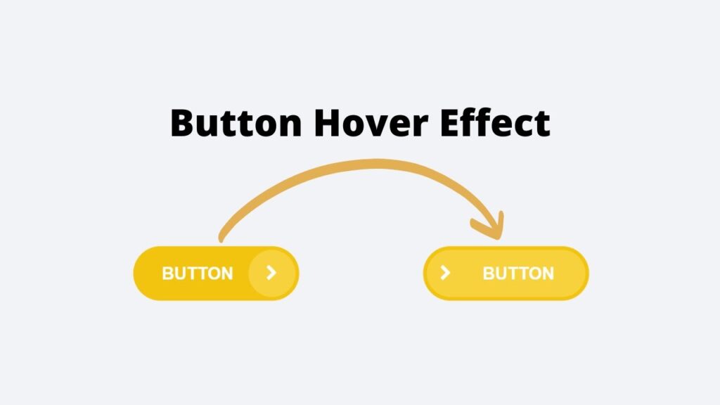
In today’s tutorial, we’ll be creating a hover effect for buttons using HTML and CSS. I’ve shared many articles and videos on JavaScript projects in the past, and now we’re going to tackle something new. Let’s get started!
Video Tutorial of Button Hover Effect Using Html And CSS
As mentioned in the video tutorial on creating a button hover effect using HTML and CSS, if you’re finding the video to be boring, you can find the code below to copy or download.
To create this effect, you’ll need to create two files – an HTML file and a CSS file. Once you’ve created these files, simply paste the provided code into each file.
First, create an HTML document called ‘index.html’ and paste the given code into it. Remember to save the file with a ‘.html’ extension.
<!DOCTYPE html>
<html lang="en">
<head>
    <meta charset="UTF-8">
    <meta name="viewport" content="width=device-width, initial-scale=1.0">
    <link rel="stylesheet" href="https://cdnjs.cloudflare.com/ajax/libs/font-awesome/4.7.0/css/font-awesome.css" integrity="sha512-5A8nwdMOWrSz20fDsjczgUidUBR8liPYU+WymTZP1lmY9G6Oc7HlZv156XqnsgNUzTyMefFTcsFH/tnJE/+xBg==" crossorigin="anonymous" referrerpolicy="no-referrer" />
    <link rel="stylesheet" href="style.css">
    <title>Button Hover Effect</title>
</head>
<body>
    <button class="btn">
        <span class="text">Button</span>
        <span class="round"><i class="fa fa-chevron-right" aria-hidden="true"></i></span>
    </button>
</body>
</html>
Next, create a CSS file called ‘style.css’ and paste the provided code into it. Remember to save the file with a ‘.css’ extension.
*
{
    margin: 0;
    padding: 0;
    box-sizing: border-box;
    font-family: sans-serif;
}
body
{
    display: flex;
    justify-content: center;
    align-items: center;
    background: #f2f3f7;
    height: 100vh;
    width: 100%;
}
.btn
{
    position: relative;
    display: inline-block;
    padding: 12px 53px 12px 23px;
    background: #f3c40f;
    color: #fff;
    text-decoration: none;
    outline: none;
    border: none;
    cursor: pointer;
    border-radius: 30px;
    transition: all 0.3s;
}
.btn span
{
    position: relative;
    z-index: 3;
}
.text
{
    font-size: 14px;
    line-height: 1.45;
    font-weight: bold;
    text-transform: uppercase;
    z-index: 2;
}
.btn .round
{
    position: absolute;
    top: 3px;
    right: 3px;
    background: #f8d23d;
    width: 38px;
    height: 38px;
    border-radius: 50%;
    transition: 0.3s ease-out;
    z-index: 1;
}
.btn .round i
{
    position: absolute;
    top: 50%;
    left: 50%;
    transform: translate(-50%,-50%);
}
.btn:hover
{
    padding-left: 48px;
    padding-right: 28px;
}
.btn:hover .round
{
    width: calc(100% - 6px);
    border-radius: 30px;
}
.btn:hover .round i
{
    left: 12%;
}
And that’s it! You’ve successfully created a button hover effect using HTML and CSS. If you’re having trouble with your code or encounter any errors, you can download the source code files by clicking on the provided download button. It’s free – just download the zip file and extract it to access the files.
I hope this helps. Good luck with your project!