In this article, we will discuss how to create an animated circular progress bar speedometer using only HTML, CS, and vanilla JavaScript. This method does not require any additional plugins or libraries, making it a simple and efficient solution for displaying progress or data visualization on a website or application.
To begin, we will first create the HTML structure for the speedometer. This will include a container element and a child element that represents the circular progress bar. We will then use CSS to style the progress bar and add a gradient fill to create a more visually appealing design.
Next, we will use JavaScript to animate the progress bar and update the value displayed on the speedometer. This can be done by manipulating the size of the progress bar and updating the text content of the speedometer element.
Finally, we will add a few additional styling and functionality touches to enhance the user experience, such as hover effects and responsive design. Overall, this tutorial will provide a step-by-step guide for creating a dynamic and engaging animated circular progress bar speedometer using HTML, CSS, and vanilla JavaScript.
Video Tutorial of Animated Circular Progress Bar Speedometer Using HTML, CSS & Vanilla JavaScript | No Plugins
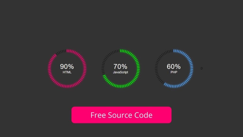
The video tutorial for creating an animated speedometer progress using HTML, CSS, and Vanilla JavaScript is available for your reference. If you find it boring, you can download or copy the code provided. To create this speedometer, you will need to create three files – one HTML file and second one CSS file and third one JavaScript File. Once you have these files, paste the provided code into them. Specifically, create an HTML document and paste the code into it. In the first place, make a HTML document with the name of index.html and paste the given codes in your HTML record. Keep in mind, you’ve to make a document with .html extension.
<!DOCTYPE html>
<html lang="en">
<head>
    <meta charset="UTF-8">
    <meta http-equiv="X-UA-Compatible" content="IE=edge">
    <meta name="viewport" content="width=device-width, initial-scale=1.0">
    <title>Animated Speedmetre Progress</title>
    <link rel="stylesheet" href="./style.css">
    <!-- S-Tech04 -->
</head>
<body>
    <div class="box">
        <div class="circle" data-dots="70" data-percent="90" style="--bgColor: #ff0070"></div>
        <div class="text">
            <h2>90%</h2>
            <small>HTML</small>
        </div>
    </div>
    <div class="box">
        <div class="circle" data-dots="70" data-percent="70" style="--bgColor: #0f0"></div>
        <div class="text">
            <h2>70%</h2>
            <small>JavaScript</small>
        </div>
    </div>
    <div class="box">
        <div class="circle" data-dots="70" data-percent="60" style="--bgColor: #52a8ff"></div>
        <div class="text">
            <h2>60%</h2>
            <small>PHP</small>
        </div>
    </div>
    <script src="./script.js"></script>
</body>
</html>
Second, make a CSS record with the name of style.css and paste the given codes in your CSS document. Keep in mind, you’ve to make a record with .css extension.
*
{
    margin: 0;
    padding: 0;
    box-sizing: border-box;
    font-family: sans-serif;
}
body
{
    display: flex;
    justify-content: center;
    align-items: center;
    min-height: 100vh;
    background: #333;
}
.box
{
    position: relative;
    margin: 50px;
}
.box .text
{
    position: absolute;
    top: 50%;
    left: 50%;
    transform: translate(-50%,-50%);
    text-align: center;
    color: #fff;
}
.box .text h2
{
    font-size: 38px;
    font-weight: 400;
    letter-spacing: 1px;
}
.box .text small
{
    font-size: 18px;
    display: block;
}

.circle
{
    width: 200px;
    height: 200px;
    display: flex;
    justify-content: center;
    align-items: center;
}
.circle .points
{
    width: 3px;
    height: 15px;
    background: #0007;
    position: absolute;
    border-radius: 3px;
    transform: rotate(calc(var(--i)*var(--rot))) translateY(-100px);

}
.points.marked
{
    animation: glow 0.04s linear forwards;
    animation-delay: calc(var(--i)*0.05s);
}

@keyframes glow
{
    0%
    {
        background: #0007;
        box-shadow: none;
    }
    100%
    {
        background: var(--bgColor);
        box-shadow: 0 0 10px var(--bgColor);
    }
}
last, create a JavaScript file with the name of script.js and paste the given codes in your JavaScript file. Remember, you’ve to create a file with .js extension.
const circles = document.querySelectorAll('.circle');
circles.forEach(elem => {
    var dots = elem.getAttribute('data-dots')
    var marked = elem.getAttribute('data-percent');
    var percent = Math.floor(dots * marked / 100);
    var rotate = 360 / dots;
    var points = "";
    for (let i = 0; i < dots; i++) {
        points += `<div class="points" style="--i: ${i}; --rot: ${rotate}deg"></div>`;
    }
    elem.innerHTML = points;
    const pointsMarked = elem.querySelectorAll('.points');
    for (let i = 0; i < percent; i++) {
        pointsMarked[i].classList.add('marked')
    }
})
That’s all, now you’ve successfully created a program to create Animated speedometer progress using Html CSS and Vanilla Javascript. If your code doesn’t work or you’ve faced any error/problem, please download the source code files from the given download button. It’s free and a .zip file will be downloaded then you’ve to extract it.
Click on the following download button to download all source code files.