Glassmorphism, also known as “Neumorphism,” is a design trend that involves creating a soft, inset, or extruded look for interface elements using gradients, shadows, and highlights. It’s a popular choice for creating modern and visually striking designs, and can be achieved using HTML and CSS.
To create a Glassmorphism profile card using HTML and CSS, you’ll need to use a combination of techniques such as the CSS box-shadow property, the CSS linear-gradient function, and the CSS transform property.
First, you’ll need to create the basic structure of the profile card using HTML elements such as a div for the card container, an image element for the profile picture, and heading and paragraph elements for the name and bio information.
Next, you can use the CSS box-shadow property to add soft, inset shadows to the card container and other elements. You can also use the CSS linear-gradient function to add a gradient effect to the background of the card, and the CSS transform property to slightly offset or rotate the card elements to create a sense of depth. To make the card responsive and look good on different screen sizes, you can use media queries and adjust the layout and styles accordingly.
Video Tutorial of How to create glassmorphism profile card using HTML & CSS
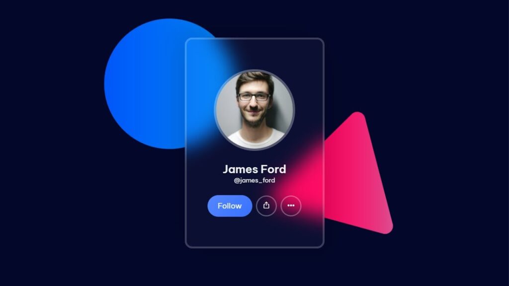
Glassmorphism Profile Card using HTML & CSS | Free Source Code
To create this program (Glassmorphism Profile Card). First, you need to create two Files one HTML File and another one is CSS File. After creating these files just paste the following codes in your file.
In the first place, make a HTML document with the name of index.html and paste the given codes in your HTML record. Keep in mind, you’ve to make a document with .html extension.
<!DOCTYPE html>
<html lang="en">

<head>
  <meta charset="UTF-8" />
  <meta http-equiv="X-UA-Compatible" content="IE=edge" />
  <meta name="viewport" content="width=device-width, initial-scale=1.0" />
  <link rel="stylesheet" href="./style.css" />
  <script src="https://unpkg.com/phosphor-icons"></script>
  <link rel="preconnect" href="https://fonts.googleapis.com" />
  <link rel="preconnect" href="https://fonts.gstatic.com" crossorigin />
  <link
    href="https://fonts.googleapis.com/css2?family=Be+Vietnam+Pro:wght@100;200;300;400;500;600;700;800;900&display=swap"
    rel="stylesheet" />
  <title>Profile Card</title>
  <!-- S-Tech04 -->
</head>

<body>
  <div class="card">
    <div class="imgBx">
      <img src="./img.jpg" alt="" />
    </div>
    <h2 class="profile-name">James Ford</h2>
    <small class="user-handle">@james_ford</small>
    <div class="profile-actions">
      <button class="btn btn-primary">Follow</button>
      <button class="btn btn-icon">
        <i class="ph-export"></i>
      </button>
      <button class="btn btn-icon">
        <i class="ph-dots-three-outline-fill"></i>
      </button>
    </div>
  </div>
</body>
</html>
Second, make a CSS record with the name of style.css and glue the given codes in your CSS document. Keep in mind, you’ve to make a record with .css extension.
*
{
    margin: 0;
    padding: 0;
    box-sizing: border-box;
    font-family: "Be Vietnam Pro", sans-serif;
}
body
{
    height: 100vh;
    display: flex;
    justify-content: center;
    align-items: center;
    background: url(./background.png) no-repeat center center fixed;
    background-size: cover;
    position: relative;
    overflow: hidden;
}
.card
{
    display: flex;
    justify-content: center;
    align-items: center;
    flex-direction: column;
    width: 90%;
    max-width: 300px;
    position: relative;
    background-color: rgba(255, 255, 255, 0.03);
    border: 4px solid rgba(255, 255, 255, 0.2);
    padding: 4rem 3rem;
    color: #f1f3f3;
    border-radius: 16px;
    backdrop-filter: blur(20px);
    box-shadow: 22px 22px 50px rgba(0, 0, 0, 0.1),
    -22px -22px 50px rgba(0, 0, 0, 0.1);
    z-index: 2;
}
.card .imgBx
{
    width: 175px;
    height: 175px;
    border-radius: 50%;
    position: relative;
    overflow: hidden;
    border: 5px solid rgba(255, 255, 255, 0.3);
}
.card .imgBx img
{
    position: absolute;
    top: 50%;
    left: 50%;
    transform: translate(-50%,-50%);
    object-fit: cover;
    width: 100%;
}
.card .profile-name
{
    font-size: 1.5rem;
    font-weight: 600;
    margin-top: 1.5rem;
}
.card .profile-actions
{
    display: flex;
    justify-content: center;
    align-items: center;
    margin-top: 1.5rem;
}
.card .profile-actions > *
{
    margin: 0 0.25rem;
}
.btn
{
    background-color: transparent;
    height: 46px;
    border: 0;
    cursor: pointer;
    line-height: 1;
    transition: 0.15s ease;
    display: flex;
    justify-content: center;
    align-items: center;
}
.btn-primary
{
    background-image: linear-gradient(135deg, #5587ff, #3772ff);
    padding: 0 1.375rem;
    border-radius: 99em;
    color: #fff;
    font-size: inherit;
}
.btn-icon
{
    width: 45px;
    height: 45px;
    border-radius: 50%;
    border: 3px solid rgba(255, 255, 255, 0.3);
    color: #ffffff;
}
.btn-icon i
{
    font-size: 1.25em;
}
.btn-icon:hover
{
    border: 3px solid #ffffff;
}
You have successfully completed the task of creating a Glassmorphism Profile Card using HTML and CSS. If you encounter any problems or errors with your code, you can download the source code files for free by clicking on the provided download button. The files will be in a .zip format, so you will need to extract them before using them.