Hello friends, today we will be learning how to create a scroll indicator using HTML, CSS, and JavaScript. I have previously posted many videos and articles about JavaScript projects, and now we will be tackling something new. Are you ready to get started?
Creating a scroll indicator can be a useful way to let users know how much content is on a page and how far they have scrolled. Here’s how you can create a scroll indicator using HTML, CSS, and JavaScript:
- Start by creating a div element that will contain the scroll indicator. You can give this element a unique id or class so that you can easily target it with your CSS and JavaScript.
- Use CSS to style the scroll indicator. You can use the width and height properties to set the size of the scroll indicator, and the background-color property to give it a color. You can also use the border and box-shadow properties to add a border and a shadow to the scroll indicator, if desired.
- Use JavaScript to track the scroll position of the page. You can use the window.scrollY property to get the current scroll position, and the window.innerHeight property to get the height of the viewport.
- Use JavaScript to update the position of the scroll indicator based on the scroll position of the page. You can use the position and top or bottom properties to set the position of the scroll indicator.
- Test your scroll indicator to make sure it is working correctly.
Video Tutorial Of How To Create Scroll Indicator Using HTML, CSS and JavaScript
In this tutorial, we will be creating a scroll indicator using HTML, CSS, and JavaScript. If you feel like following along with the video tutorial, great! If you prefer to just see the code and give it a try on your own, the HTML and CSS code is provided below.
To create the scroll indicator, you will need to create two files – an HTML file and a CSS file. Once you have those set up, you can paste the following code into your files to get started.
To begin, create an HTML document called “index.html” and paste the provided code into it. Remember to save the file with the “.html” extension.
<!DOCTYPE html>
<html lang="en">
<head>
<meta charset="UTF-8">
<meta name="viewport" content="width=device-width, initial-scale=1.0">
<link rel="stylesheet" href="style.css">
<title>Scroll Indicator</title>
</head>
<body>
<div id="indicator"></div>
<div id="scrollPath"></div>
<section>
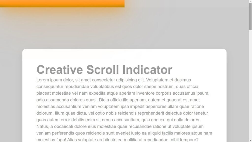
<h2>Creative Scroll Indicator</h2>
<p> paste your text here </p>
</section>
<script>
let indicator = document.getElementById('indicator');
let totalHeight = document.body.scrollHeight - window.innerHeight;
window.onscroll = function(){
let indicatorWidth = (window.scrollY / totalHeight) * 100;
indicator.style.width = indicatorWidth + "%";
}
</script>
</body>
</html>
Next, create a CSS file called “style.css” and paste the provided code into it. Remember to save the file with the “.css” extension.
*
{
    margin: 0;
    padding: 0;
    font-family: sans-serif;
}
body
{
   padding: 80px 9%;
   background: #ccc;
}
section
{
    padding: 50px;
    background: #fff;
    border-radius: 5px;
    box-shadow: 0 5px 10px rgba(0,0,0,0.1);
}
section h2
{
    font-size: 2em;
    color: #999;
}
section p
{
    line-height: 1.5;
    font-size: 1.2em;
    color: #999;
}
#scrollPath
{
    position: fixed;
    top: 0;
    left: 0;
    width: 100%;
    height: 10px;
    background: rgba(255,255,255,0.05);
}
#indicator
{
    position: fixed;
    top: 0;
    left: 0;
    height: 10px;
    background: linear-gradient(to top, #008aff,#00ffe7);
    animation: animate 5s linear infinite;
}
@keyframes animate
{
    0%
    {
        filter: hue-rotate(0deg);
    }
    100%
    {
        filter: hue-rotate(360deg);
    }
}
#indicator::before
{
    content: '';
    position: absolute;
    top: 0;
    left: 0;
    width: 100%;
    height: 100%;
    background: linear-gradient(to top, #008aff,#00ffe7);
    filter: blur(30px);
}
#indicator::after
{
    content: '';
    position: absolute;
    top: 0;
    left: 0;
    width: 100%;
    height: 100%;
    background: linear-gradient(to top, #008aff,#00ffe7);
    filter: blur(30px);
}
You have now completed the process of creating a scroll indicator using HTML, CSS, and JavaScript. If you encountered any issues or errors while writing the code, you can download the source code files by clicking on the provided download button. The files are free and come in a .zip file that you will need to extract. Click the download button below to access the source code files.