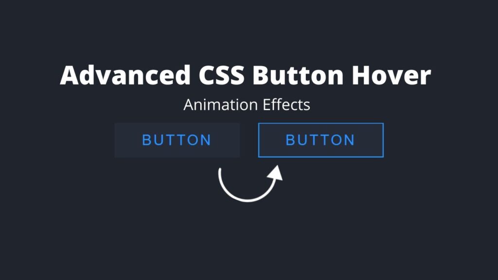
Welcome everyone, in this tutorial we will learn how to create a button hover effect using HTML and CSS. In the past, I have shared a number of videos and articles on JavaScript projects, but this time we will be exploring something new.
Creating a button hover effect with HTML and CSS is a simple and effective way to add interactivity to your website. Here is how you can create a button hover effect:
- First, create a basic button element using HTML. This can be done by using the <button> element.
- Next, style the button using CSS. You can set the background color, font color, and border of the button to your desired look.
- To create the hover effect, you can use the :hover pseudo-class in your CSS. This will apply a style to the button when the user’s mouse is hovering over it.
- You can also use transitions to create a smooth animation when the hover effect is triggered.
- To further customize the hover effect, you can use the :active pseudo-class to apply a style to the button when it is being clicked.
Video Tutorial Of How To Create Button Hover Effect Using HTML and CSS
In the above tutorial, we show you how to create a button hover effect using HTML and CSS. If you prefer to follow along with written instructions, you can find the code snippets below.
To get started, you will need to create two files: an HTML file and a CSS file. Once you have created these files, you can paste the following code into your HTML file. Remember to save the file with a .html extension.
In the HTML file, you will find the code necessary to create the button hover effect. Simply follow the instructions in the video tutorial or refer to the written instructions provided. With a little bit of effort, you will have a stylish and interactive button in no time.
<!DOCTYPE html>
<html lang="en">
<head>
   <meta charset="UTF-8">
   <meta http-equiv="X-UA-Compatible" content="IE=edge">
   <meta name="viewport" content="width=device-width, initial-scale=1.0">
   <link rel="stylesheet" href="style.css">
   <title>Button Hover Effect</title>
</head>
<body>
   <a href="#">
      <span></span>
      <span></span>
      <span></span>
      <span></span>
      button
   </a>
   <a href="#">
      <span></span>
      <span></span>
      <span></span>
      <span></span>
      button
   </a>
</body>
</html>
To ensure that your website is properly styled, it is important to create a CSS document with the name “style.css” and paste the provided codes into it. Remember to save the document with a .css extension. This will allow you to easily apply these styles to your website.
*
{
   margin: 0;
   padding: 0;
   box-sizing: border-box;
   font-family: sans-serif;
}
body
{
   display: flex;
   justify-content: center;
   align-items: center;
   flex-direction: column;
   background: #1f242d;
   height: 100vh;
   width: 100%;
}
a
{
   position: relative;
   display: inline-block;
   padding: 10px 30px;
   background: #262c37;
   margin: 10px;
   text-decoration: none;
   text-transform: uppercase;
   color: #2894ff;
   letter-spacing: 2px;
}
a:hover
{
   background: #2894ff;
   color: #1f242d;
   transition: 0.5s;
   transition-delay: 1s;
}
a span
{
   position: absolute;
   display: block;
   background: #2894ff;
}
a span:nth-child(1)
{
   top: 0;
   left: 0;
   width: 1px;
   height: 100%;
   transform: scaleY(0);
   transform-origin: top;
   transition: transform 0.25s;
}
a:hover span:nth-child(1)
{
   transform: scaleY(1);
   transform-origin: bottom;
   transition: transform 0.25s;
}
a span:nth-child(2)
{
   top: 0;
   right: 0;
   width: 100%;
   height: 1px;
   transform: scaleX(0);
   transform-origin: right;
   transition: transform 0.25s;
   transition-delay: 0.25s;
}
a:hover span:nth-child(2)
{
   transform: scaleX(1);
   transform-origin: left;
   transition: transform 0.25s;
   transition-delay: 0.25s;
}
a span:nth-child(3)
{
   top: 0;
   right: 0;
   width: 1px;
   height: 100%;
   transform: scaleY(0);
   transform-origin: bottom;
   transition: transform 0.25s;
   transition-delay: 0.5s;
}
a:hover span:nth-child(3)
{
   transform: scaleY(1);
   transform-origin: top;
   transition: transform 0.25s;
   transition-delay: 0.5s;
}
a span:nth-child(4)
{
   bottom: 0;
   left: 0;
   width: 100%;
   height: 1px;
   transform: scaleX(0);
   transform-origin: left;
   transition: transform 0.25s;
   transition-delay: 0.75s;
}
a:hover span:nth-child(4)
{
   transform: scaleX(1);
   transform-origin: right;
   transition: transform 0.25s;
   transition-delay: 0.75s;
}
Congratulations on creating a program Button Hover effect using HTML and CSS! If you encounter any errors or issues with your code, you can easily access the source code files by clicking the download button below. The source code is available for free in a .zip file that you can extract after downloading. Simply click on the download button to access all the source code files.