Preloaders, also known as “loading indicators,” are used to inform users that a webpage or application is loading or processing. Preloaders are often used to improve the user experience by providing visual feedback while the content is being loaded.
In this article, we have discussed how to create a preloader using HTML and CSS. We have outlined the steps involved in creating a container element for the preloader, adding a loading animation or message, positioning the preloader on the page, and using JavaScript to show and hide the preloader.
To create a preloader using HTML and CSS, you will need to use a combination of HTML elements and CSS styles. Here is a high-level overview of the steps involved:
- Create an HTML element to contain the preloader. This could be a div element or any other suitable element.
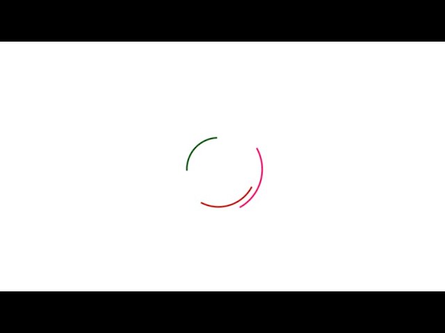
- Add a loading message or graphic inside the container element. This could be a simple text message or a more complex graphic such as a spinning icon.
- Use CSS styles to style the container element and the loading message or graphic. For example, you could set the background color of the container element, or adjust the size and color of the loading message or graphic.
- Use JavaScript to control the visibility of the preloader. When the webpage or application is ready, you can use JavaScript to hide the preloader and show the main content.
Hello friends, today we will be going to how do we Create A Preloader Using Html & CSS. I have posted many videos and articles before related to the JavaScript project, now this the something new that we are going to build.
Video Tutorial of How To Create A Preloader Using Html & CSS
In the above video tutorial, you have learn how to create a preloader using HTML and CSS. If you are finding the tutorial to be boring, you can simply copy or download the provided codes below. To create this preloader, you will need to create two separate files – an HTML file and a CSS file. Once you have created these files, you can paste the provided codes into them. Specifically, you should create an HTML document with the name “index.html” and paste the codes into this file. Remember to save the file with the “.html” extension.
To start, create an HTML document called “index.html” and paste the provided code into the document. Remember to save the file with the .html extension.
<!DOCTYPE html>
<html lang="en">
<head>
    <meta charset="UTF-8">
    <meta name="viewport" content="width=device-width, initial-scale=1.0">
    <link rel="stylesheet" href="style.css">
    <title>Loader Animation</title>
</head>
<body onload="myFunction()">
    <div class="loader-wrapper" id="loader">
        <div class="loader">
            <span style="--i:1"></span>
            <span style="--i:2"></span>
            <span style="--i:3"></span>
        </div>
    </div>
    <iframe width="560" height="315" src="https://www.youtube-nocookie.com/embed/zd7KqEioHjg" frameborder="0" allow="accelerometer; autoplay; clipboard-write; encrypted-media; gyroscope; picture-in-picture" allowfullscreen></iframe>
    <script>
        var preloader = document.getElementById('loader');

        function myFunction(){
            preloader.style.display = 'none'
        }
    </script>
</body>
</html>
Second, make a CSS record with the name of style.css and glue the given codes in your CSS document. Keep in mind, you’ve to make a record with .css extension.
*
{
    margin: 0;
    padding: 0;
    box-sizing: border-box;
}
body
{
    font-family: sans-serif;
}
.loader-wrapper
{
    position: fixed;
    top: 0;
    left: 0;
    width: 100%;
    z-index: 1000;
    display: flex;
    justify-content: center;
    align-items: center;
    background: #fff;
    min-height: 100vh;

}
.loader
{
    position: relative;
    width: 200px;
    height: 200px;
    border-radius: 50%;
    overflow: hidden;
    transform: rotate(175deg);
}
.loader span
{
    position: absolute;
    top: calc(12px * var(--i));
    left: calc(12px * var(--i));
    right: calc(12px * var(--i));
    bottom: calc(12px * var(--i));
    border: 3px solid transparent;
    border-radius: 50%;
    border-left-color: rgb(98, 0, 255);
    animation: animate 1s linear infinite;
    filter: hue-rotate(calc(60deg * var(--i)));
    animation-delay: calc(-0.1s * var(--i));
}
.loader span:nth-child(1)
{

    animation-duration: 2s;
}
.loader span:nth-child(2)
{
    animation-duration: 1s;
}
.loader span:nth-child(3)
{
    animation-duration: 0.5s;
}
@keyframes animate
{
    0%
    {
        transform: rotate(0deg);
    }
    100%
    {
        transform: rotate(360deg);
    }
}
That’s all, now you’ve successfully created a program to How To Create A Preloader Using Html & CSS. If your code doesn’t work or you’ve faced any error/problem, please download the source code files from the given download button. It’s free and a .zip file will be downloaded then you’ve to extract it.
Click on the following download button to download all source code files.