Creating a creative card hover effect can add an interactive and visually appealing element to your website or web application. This effect can be achieved using HTML and CSS, and can be customized to fit the specific design needs of your project.
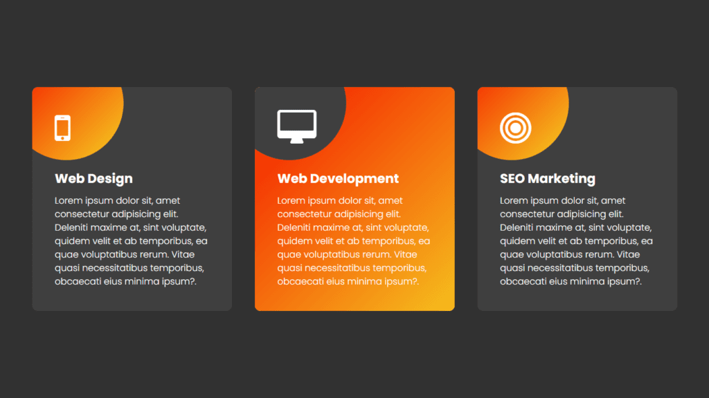
To create a card hover effect, you will need to start by setting up the HTML structure for your card. This will typically include a container element, such as a div, and a series of inner elements for the card content. For example, you might have a title, an image, and some descriptive text.
Next, you will need to style these elements using CSS. This will involve defining the layout and appearance of the card, as well as any hover effects you want to include. To create a hover effect, you will need to use the :hover pseudo-class in your CSS. This will allow you to define a set of styles that will be applied when the user’s mouse hovers over the card.
For example, you might want to change the background color of the card when it is hovered over, or you might want to add a drop shadow or border to give the card a raised or three-dimensional effect. You can also use the transition property to create a smooth and seamless transition between the normal and hover states of the card.
In addition to these basic styles, you can also add additional interactivity to your card hover effect by using JavaScript or other programming languages. For example, you might want to include a link or button that appears when the card is hovered over, or you might want to display additional information or a pop-up window.
Overall, creating a creative card hover effect using HTML and CSS is a simple and effective way to add interactive and visually appealing elements to your website or web application. By using the :hover pseudo-class and the transition property, you can create a variety of hover effects that will engage and delight your users.
Video Tutorial of Creative Card Hover Effect Using HTML & CSS
As mentioned in the video tutorial on creating a creative card hover effect using HTML and CSS, if you’re finding the video to be boring, you can find the code below to copy or download.
To create this effect, you’ll need to create two files – an HTML file and a CSS file. Once you’ve created these files, simply paste the provided code into each file.
First, create an HTML document and paste the given code into it. Remember to save the file with a ‘.html’ extension.
<!DOCTYPE html>
<html lang="en">
<head>
    <meta charset="UTF-8">
    <meta name="viewport" content="width=device-width, initial-scale=1.0">
    <link rel="stylesheet" href="https://cdnjs.cloudflare.com/ajax/libs/font-awesome/4.7.0/css/font-awesome.css" integrity="sha512-5A8nwdMOWrSz20fDsjczgUidUBR8liPYU+WymTZP1lmY9G6Oc7HlZv156XqnsgNUzTyMefFTcsFH/tnJE/+xBg==" crossorigin="anonymous" referrerpolicy="no-referrer" />
    <link rel="stylesheet" href="style.css">
    <title>Creative Card Hover Effect</title>
    <!-- Created by S-Tech04 -->
</head>
<body>
    <div class="container">
        <div class="card">
            <div class="icon">
                <i class="fa fa-mobile" aria-hidden="true"></i>
            </div>
            <div class="content">
                <h3>Web Designing</h3>
                <p>Lorem ipsum dolor sit amet consectetur adipisicing elit. Et natus placeat voluptates, ratione sunt nulla pariatur recusandae consectetur soluta quasi perferendis totam deserunt molestiae aperiam veritatis est! Officiis, unde necessitatibus?.</p>
            </div>
        </div>
        <div class="card">
            <div class="icon">
                <i class="fa fa-desktop" aria-hidden="true"></i>
            </div>
            <div class="content">
                <h3>Web Development</h3>
                <p>Lorem ipsum dolor sit amet consectetur adipisicing elit. Et natus placeat voluptates, ratione sunt nulla pariatur recusandae consectetur soluta quasi perferendis totam deserunt molestiae aperiam veritatis est! Officiis, unde necessitatibus?.</p>
            </div>
        </div>
        <div class="card">
            <div class="icon">
                <i class="fa fa-bullseye" aria-hidden="true"></i>
            </div>
            <div class="content">
                <h3>SEO Marketing</h3>
                <p>Lorem ipsum dolor sit amet consectetur adipisicing elit. Et natus placeat voluptates, ratione sunt nulla pariatur recusandae consectetur soluta quasi perferendis totam deserunt molestiae aperiam veritatis est! Officiis, unde necessitatibus?.</p>
            </div>
        </div>
    </div>
</body>
</html>
Second, make a CSS record with the name of style.css and glue the given codes in your CSS document. Keep in mind, you’ve to make a record with .css extension.
@import url('https://fonts.googleapis.com/css2?family=Poppins:wght@100;200;300;400;500;700;900&display=swap');
*
{
  margin: 0;
  padding: 0;
  box-sizing: border-box;
  font-family: 'Poppins',sans-serif;
}
body
{
  display: flex;
  justify-content: center;
  align-items: center;
  min-height: 100vh;
  background: #313131;
}
.container
{
  position: relative;
  display: flex;
  justify-content: center;
  align-items: center;
  flex-wrap: wrap;
  width: 1200px;
}
.container .card
{
  position: relative;
  width: 350px;
  padding: 40px;
  margin: 20px;
  background: #3f3f3f;
  border-radius: 10px;
  overflow: hidden;
  z-index: 1;
}
.container .card::after
{
  content: '';
  position: absolute;
  top: -72px;
  left: -42px;
  width: 200px;
  height: 200px;
  background-color: #f5d020;
  background-image: linear-gradient(315deg, #f5d020 0%, #f53503 75%);
  transition: cubic-bezier(0.39, 0.58, 0.57, 1) all 0.15s;
  z-index: -2;
  border-radius: 50%;
}
.container .card::before
{
  content: '';
  position: absolute;
  top: -200px;
  left: -200px;
  width: 200px;
  height: 200px;
  background-color: #3f3f3f;
  transition: cubic-bezier(0.39, 0.58, 0.57, 1) all 0.55s;
  z-index: -1;
  border-radius: 50%;
}

.container .card:hover::after
{
  width: 120%;
  height: 120%;
  border-radius: 0;
  top: -10%;
  left: -10%;
  transition: cubic-bezier(0.39, 0.58, 0.57, 1) all 0.55s;
}
.container .card:hover::before
{
  top: -72px;
  left: -42px;
}
.container .icon
{
  margin-bottom: 10px;
}
.container .icon .fa
{
  font-size: 3.5em;
  color: #fff;
}
.container .content
{
  margin-top: 40px;
}
.container .content h3
{
  font-size: 24px;
  color: #fff;
  font-weight: 700;
  margin-bottom: 10px;
}
.container .content p
{
  font-size: 16px;
  color: #fff;
  font-weight: 300;
}
In conclusion, the creative card hover effect is a visually appealing and interactive design element that can be easily implemented on your website using HTML and CSS. It adds depth and personality to your website, and can be customized to fit the style and theme of your site. By following the steps outlined in this article, you can create your own unique card hover effect and enhance the user experience on your website. Experiment with different transitions and transformations to find the perfect hover effect for your project.
Click on the following download button to download all source code files.