Hello everyone, today we’ll be learning how to create a computer monitor shape using HTML and CSS. While I’ve shared many articles and videos on JavaScript projects in the past, this time we’ll be tackling something new. Let’s get started!
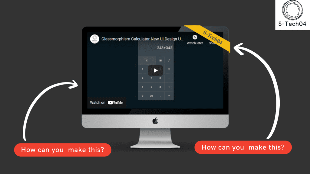
Video Tutorial of Computer Monitor Shape – Using Html and CSS
As mentioned in the video tutorial on creating a computer monitor shape using HTML and CSS, if you’re finding the video to be boring, you can find the code below to copy or download.
To create this shape, you’ll need to create two files – an HTML file and a CSS file. Once you’ve created these files, simply paste the provided code into each file.
First, create an HTML document called ‘index.html’ and paste the given code into it. Remember to save the file with a ‘.html’ extension.
<!DOCTYPE html>
<html lang="en">
<head>
    <meta charset="UTF-8">
    <meta name="viewport" content="width=device-width, initial-scale=1.0">
    <title>Computer Monitor Shape - Using Html, CSS</title>
    <link rel="stylesheet" href="style.css">

    <!-- Created By S-Tech04 -->

</head>
<body>
    <div class="container">
        <div class="monitor">
            <img class="monitorImage" src="./monitor.png">
            <iframe class="video" src="https://www.youtube.com/embed/zO6zgt-C-vQ" allowfullscreen="" ></iframe>
            <svg width="252px" height="155px" viewBox="0 0 252 155" class="svg">
                <g stroke="none" stroke-width="1" fill="none" fill-rule="evenodd">
                    <g fill="#F2BB13">
                        <polygon points="87 0 252 93.013245 252 148 0 2.78561896e-14"></polygon>
                    </g>
                    <text transform="translate(147.575025, 59.538378) rotate(32.000000) translate(-147.575025, -59.538378) " font-family="OpenSans-Bold, Open Sans" font-size="30" font-weight="bold" fill="#454C55">
                        <tspan x="100.000000" y="70.0000000">S-Tech04</tspan>
                    </text>
                    <polygon fill="#AD8200" points="243 142 243 155 252 148"></polygon>
                    <polygon fill="#AD8200" points="0 6 0 0 9 6"></polygon>
                </g>
            </svg>
        </div>
    </div>
</body>
</html>
Next, create a CSS file called ‘style.css’ and paste the provided code into it. Remember to save the file with a ‘.css’ extension.
*
{
    margin: 0;
    padding: 0;
    box-sizing: border-box;
}
body
{
    font-family: 'Open Sans', 'Lato', 'sans-serif';
    background: #333;
}
.container
{
    display: flex;
    justify-content: center;
    align-items: center;
    flex-wrap: wrap;
    height: 100vh;
    width: 100%;
}
.monitor {
    width: 660px;
    height: 550px;
    position: relative;
    flex-shrink: 0;
    margin: 20px;
}
.monitor .monitorImage{
    width: 100%;
}

.video {
    top: 5.7%;
    left: 4.9%;
    width: 90.8%;
    border: 0;
    height: 62%;
    z-index: 1;
    position: absolute;
}

.svg {
    top: -12px;
    right: -2px;
    width: 204px;
    z-index: 1;
    position: absolute;
}
And that’s it! You’ve successfully created a computer monitor shape using HTML and CSS. If you’re having trouble with your code or encounter any errors, you can download the source code files by clicking on the provided download button. It’s free – just download the zip file and extract it to access the files.
I hope this helps. Good luck with your project!